

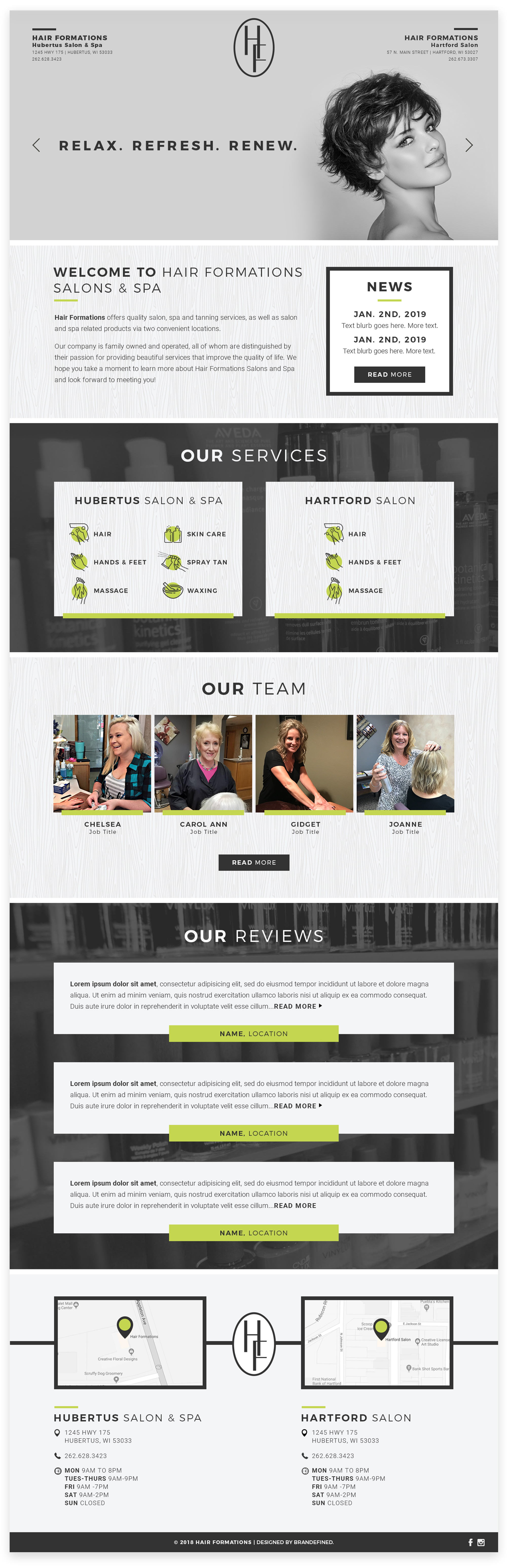
Hair Formations went through a pretty significant logo refresh at the beginning of this project, inspiring a new, more modern, color palette and overall visual identity. Two design requests our client had was to use a woodgrain pattern or texture within the design, and to keep the lime green from the original branding as the only color used, besides photos, throughout the site.


Using Typography, Color, & Texture to Create a Brand
Using a subtle and modern woodgrain pattern and the Hair Formations lime green, I chose simple line icons, highlighting them with a splash of color behind each icon. My design uses the same typography as used in the logo, Montserrat, one of my favorite freebies from GoogleFonts. Montserrat has a great variety of weights, which lends to the hierarchy of information while maintaining a consistency in appearance.
Creating Seamless Transitions
The navigation for the homepage of the Hair Formations website differs from all other pages. The sites navigation is hidden from the user when they arrive on the homepage of the site, appearing once they begin to scroll down the page. The navigation is only hidden until scroll on the homepage of the site, to give more space to and highlight the featured hair model. On all other pages besides the homepage, the navigation appears upon landing on the page and stays in place as the information contained on each page scrolls beneath, this is so that the visitor has access to the ‘book now’ button at any point during their visit to the site.
