Work Produced at: Kait Carr Creative for Trillium Transit / Optibus
Services: web design, identity system, web design, wireframing, mockup & prototyping, iconography, illustration
Web Development: Chance Corbeil
Project Management: Doug Donaldson
Objective: Redesign the ATN website to be user-friendly and highly accessible to all. Bring consistency to the branding overall, and modernize the new websites’ aesthetic. Improve upon the user experience by reorganizing content, while simplifying and de-cluttering the visual space of unnecessary information.
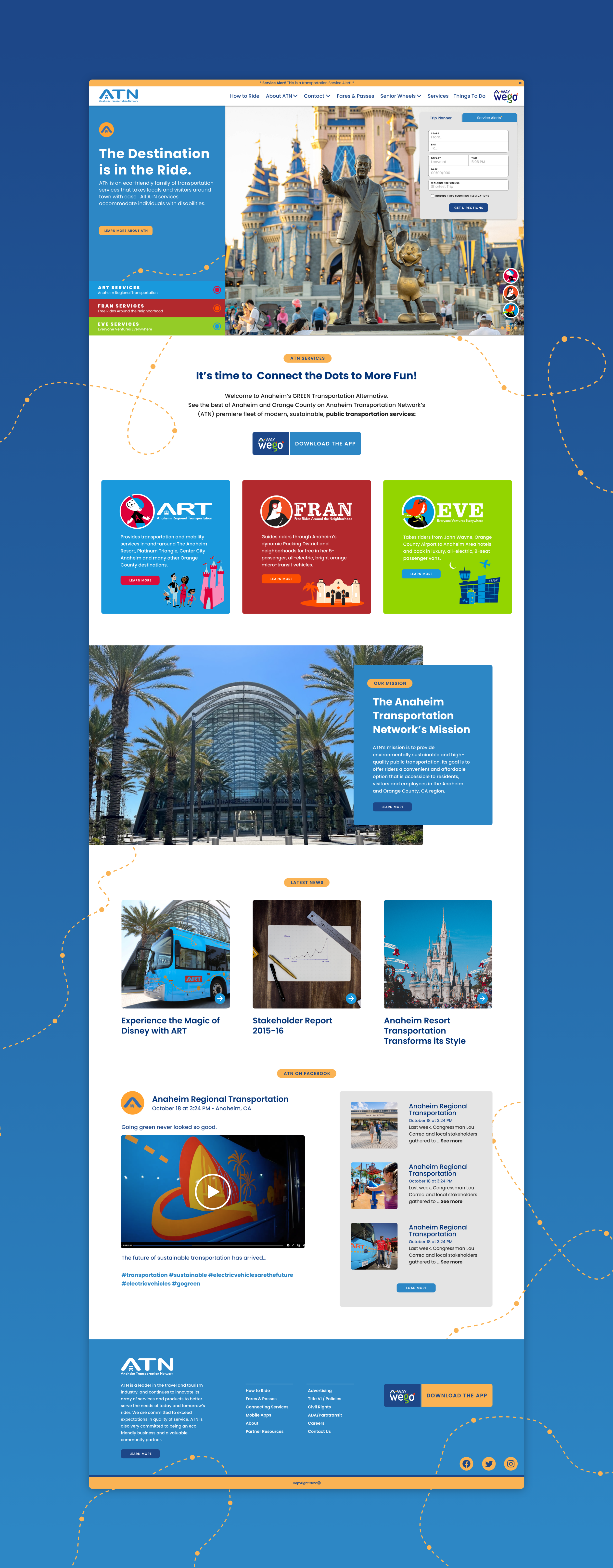
ATN’s original public transportation website had a clunky, outdated user interface and overall experience. Users had difficulties finding route information, purchasing bus faire, and were unable to plan future trips.

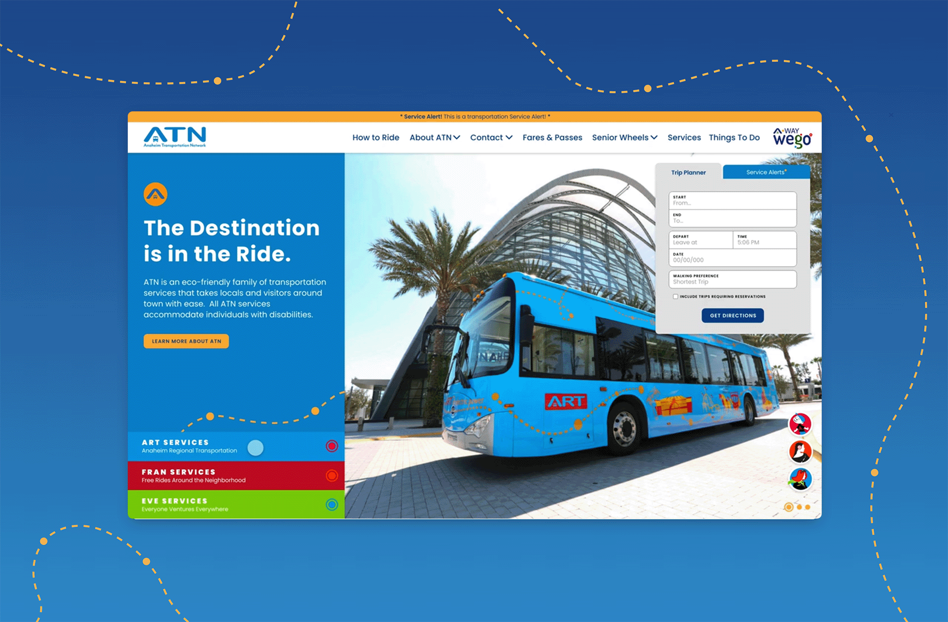
The solution I proposed was to relocate the top three items users would be visiting the site for, above the fold on the homepage. I designed an accordion menu that provides easy access to the information and services users are visiting the site for, all before scrolling below the fold.
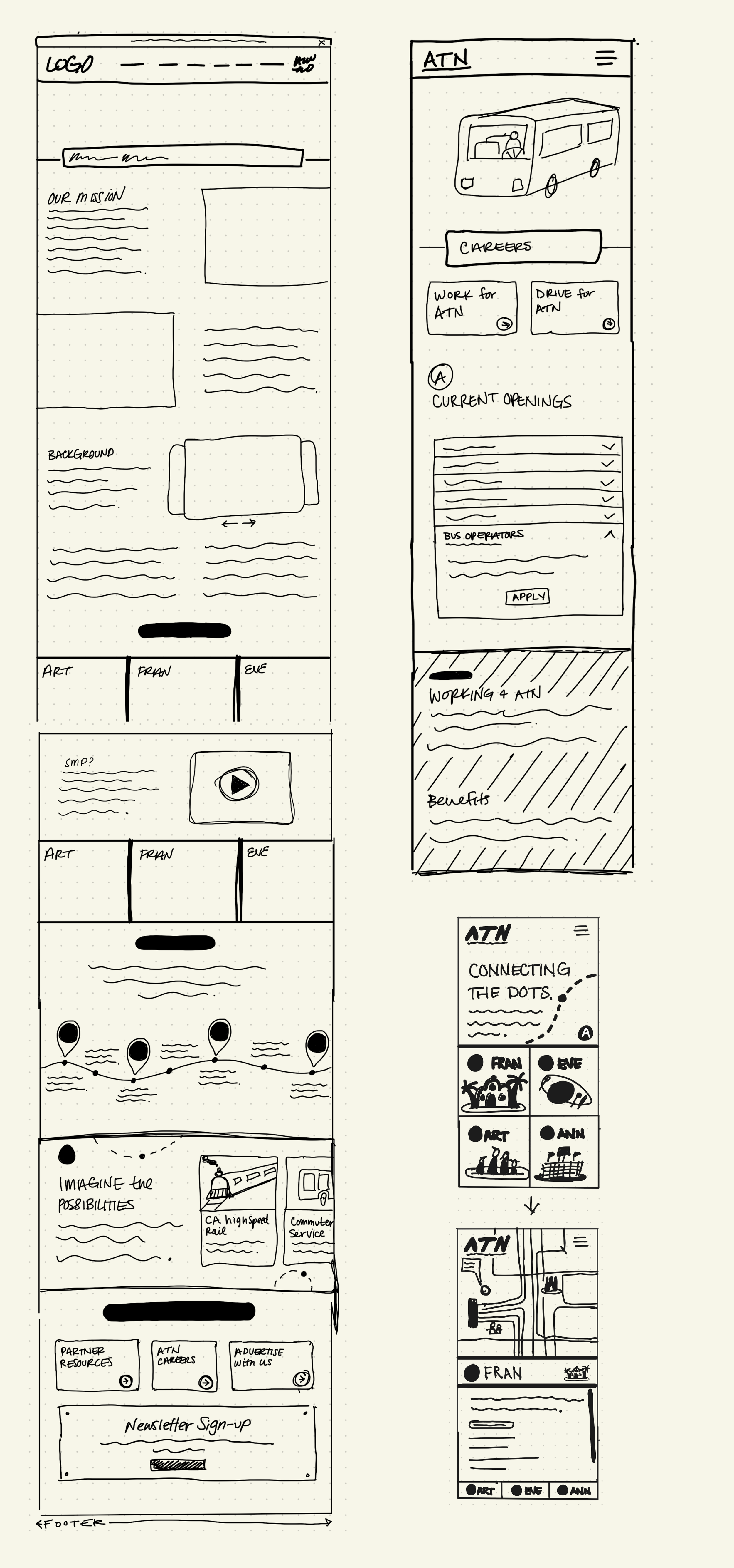
I created an interactive prototype of my homepage design mockup so that we could demonstrate the proposed solution to the ATN team, and so developers could better understand how the component would function.
Primary Branding
ATN has a primary color palette that visually defines the network.
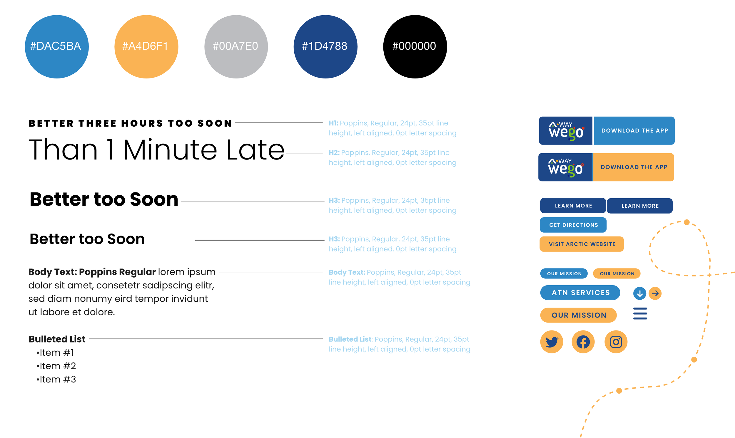

Transportation Family Branding
There are three service lines within the Anaheim Transportation Network. Each service line has it’s own color palette and graphic elements to help visually separate the services offered by each.

Interactive Prototypes
There are many interactive elements presented to the user before even scrolling down the home page. Having an interactive prototype of the new website design gave the ATN team a solid understanding of the proposed design solutions, helping to prevent future development re-work, thus saving labor cost and shortening project timeline.
Several templates were designed for the many secondary pages, the About Us page however included a couple of custom interactive elements, like the History of ATN timeline.
Mobile First
I always use a mobile-first approach when designing websites, and with 86% of ATN’s site visitors coming from a mobile device, it was especially important to prioritize the mobile experience for this, and all other public transportation projects.

Interactive Maps
The Anaheim Transportation Network needed a website overhaul, including a redesign and restructuring of their route maps. The new maps are interactive, visually consistent and connected to detailed information.
Before

The original map of Anaheim bus routes was cluttered with confusing and contradictory information. There was no consistency in color palette or line weight, and the branding of the various service lines clashed with each other. The original maps were static images with no interactivity or links to additional information.

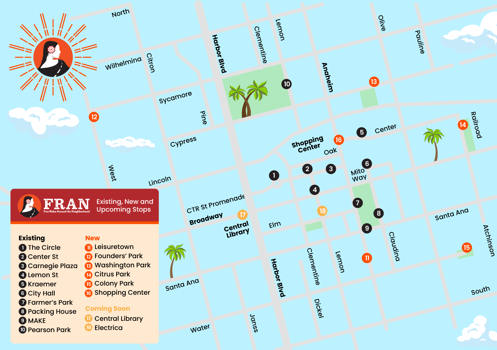
After
The re-designed maps are fully interactive with links to each route, destination, and amenity. The overall map color palettes have been adjusted to reflect the primary ATN color palette and the color palettes of the transportation families within the ATN umbrella. The various brand colors no longer clash, and though there is still plenty of information presented, consistency of the visual elements and reorganization of information improve the user experience.