Work Produced at: Avamere Family of Companies, Marketing & Communications Department for Infinity Rehab
Platform & Tools: Wordpress, Adobe Illustrator and Photoshop, Adobe XD
Front-end Development: Kait Carr
Back-end Development: Brian Mann, Doug Donaldson
Web Design & Identity: Kait Carr
Copywriting: Meg Hodson, Shaelynn Miller
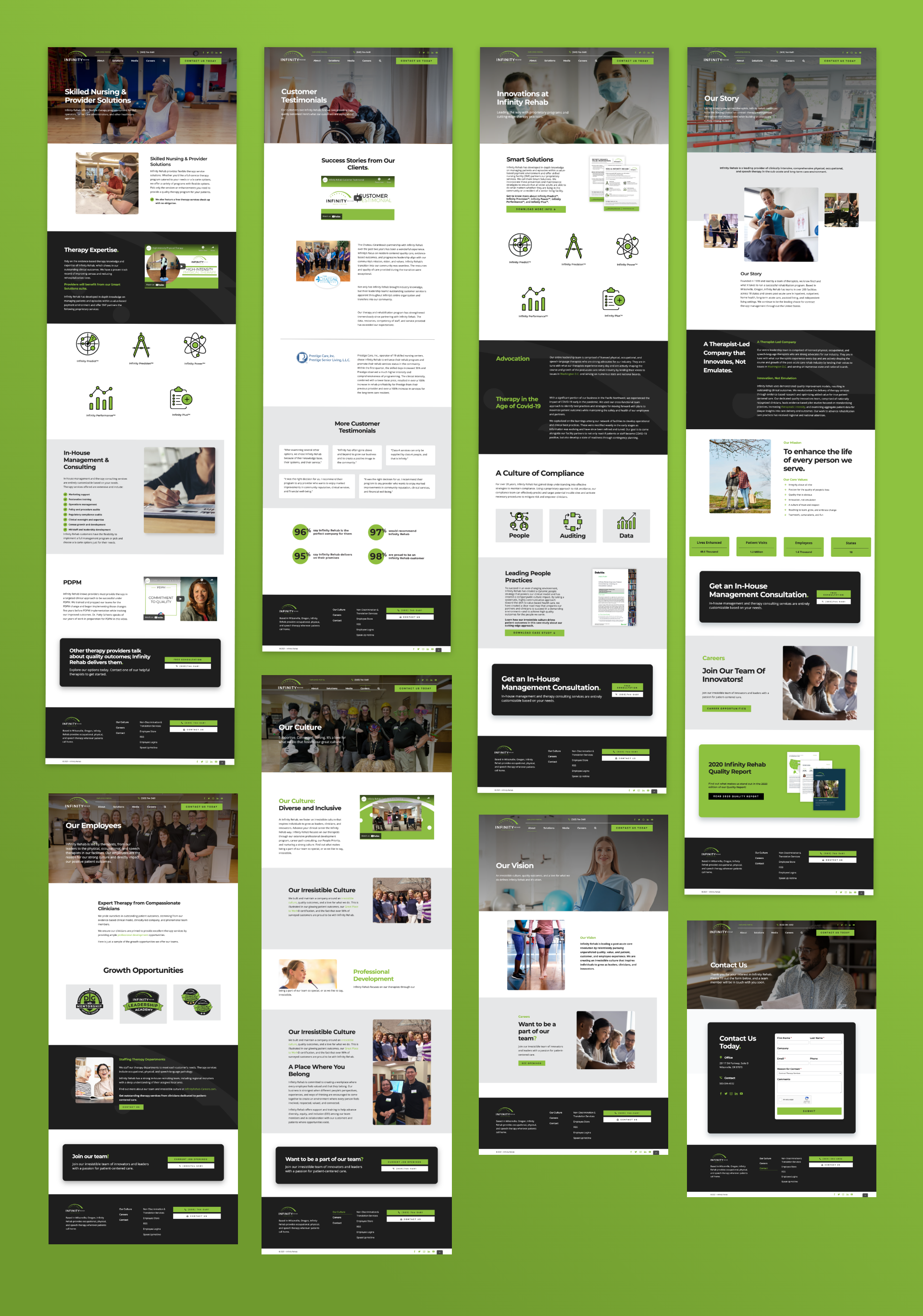
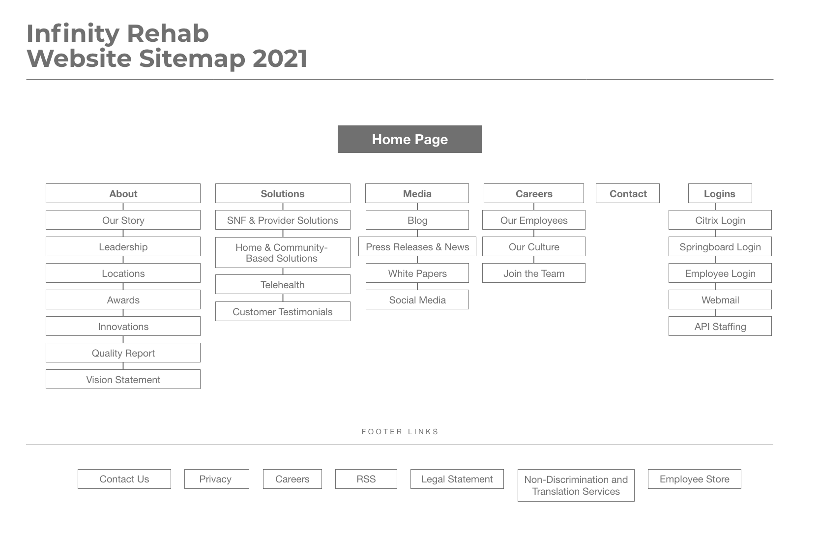
Problem: Infinity rehab has two different audiences it caters to. One audience is therapists and the other is patients looking for therapy. Both of these audiences are visiting the site to find information and resources pertaining to physical therapy, speech language pathology, or occupational therapy.
Therapists needed a space to find resources on furthering their education, attending networking events, and updates to national rules and regulations. Patients would need to easily find therapy in their area, learn about the company along with what it’s like to work with our therapists.
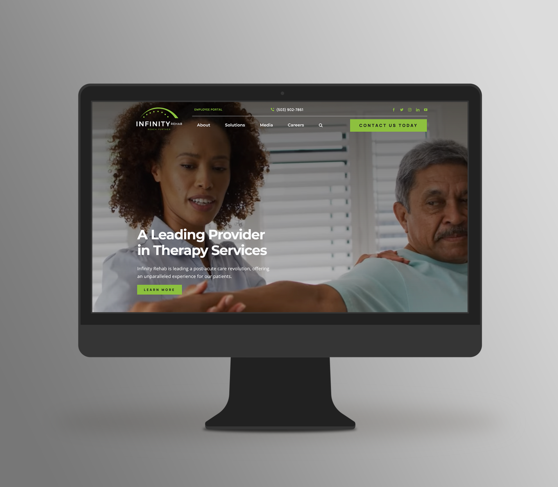
Solution: After being welcomed, the user is presented with the three options, therapist resources, patient resources, or scroll further to continue to learn about the company. It’s intended to be clear from the start where the user may find the information they’re visiting the site for.

An Updated Therapy Resource
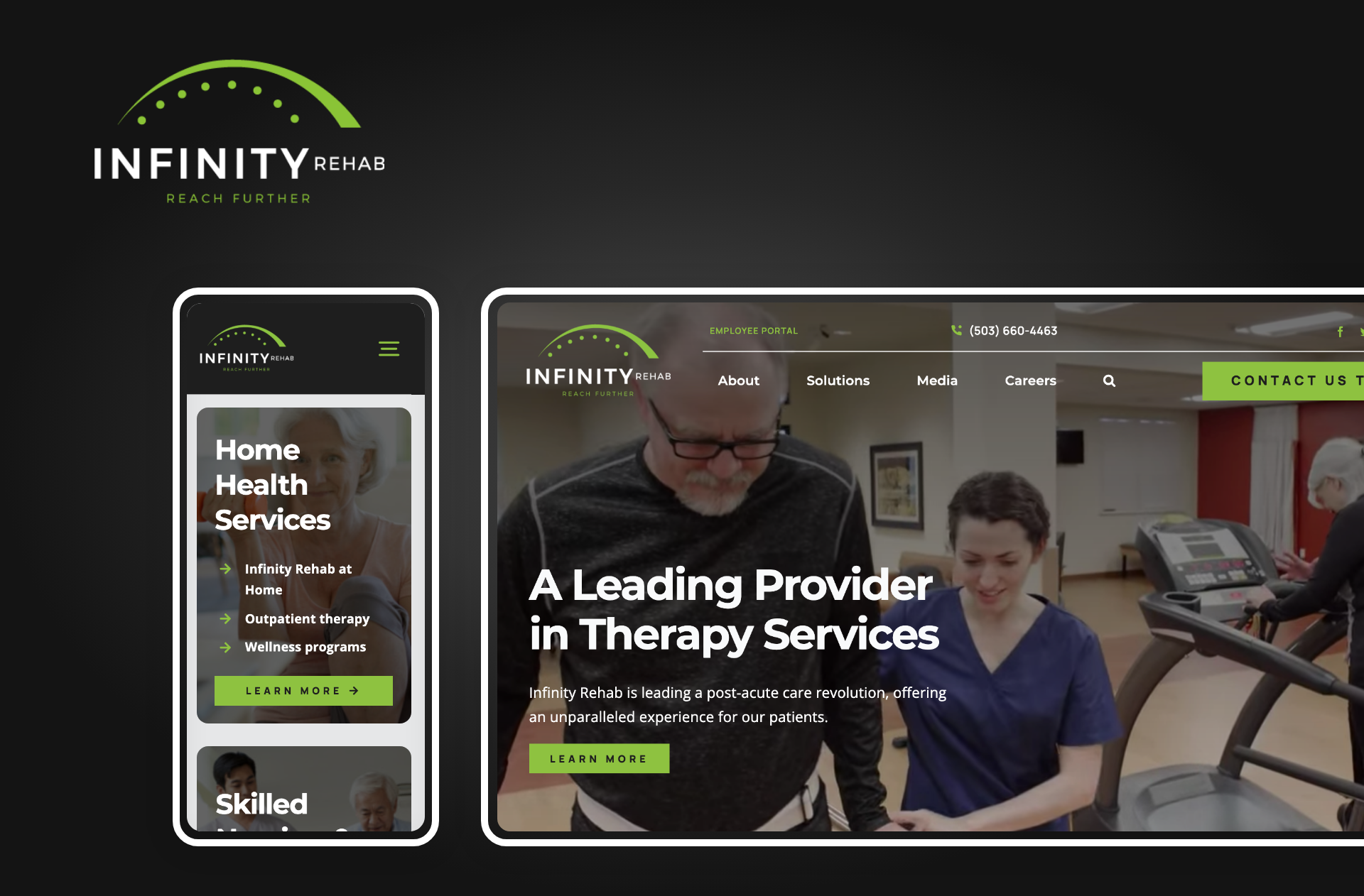
The old Infinity Rehab website was outdated and difficult to navigate - not to mention it wasn’t at all mobile-friendly.
The goal was to update the brand and overall look for Infinity rehab - changes that had already been made to their brand assets across social media platforms and print collateral. I crafted a new identity system around the recent brand update, the new system consists of a high-energy green along with bold line icons and an overall crisp and clean aesthetic.